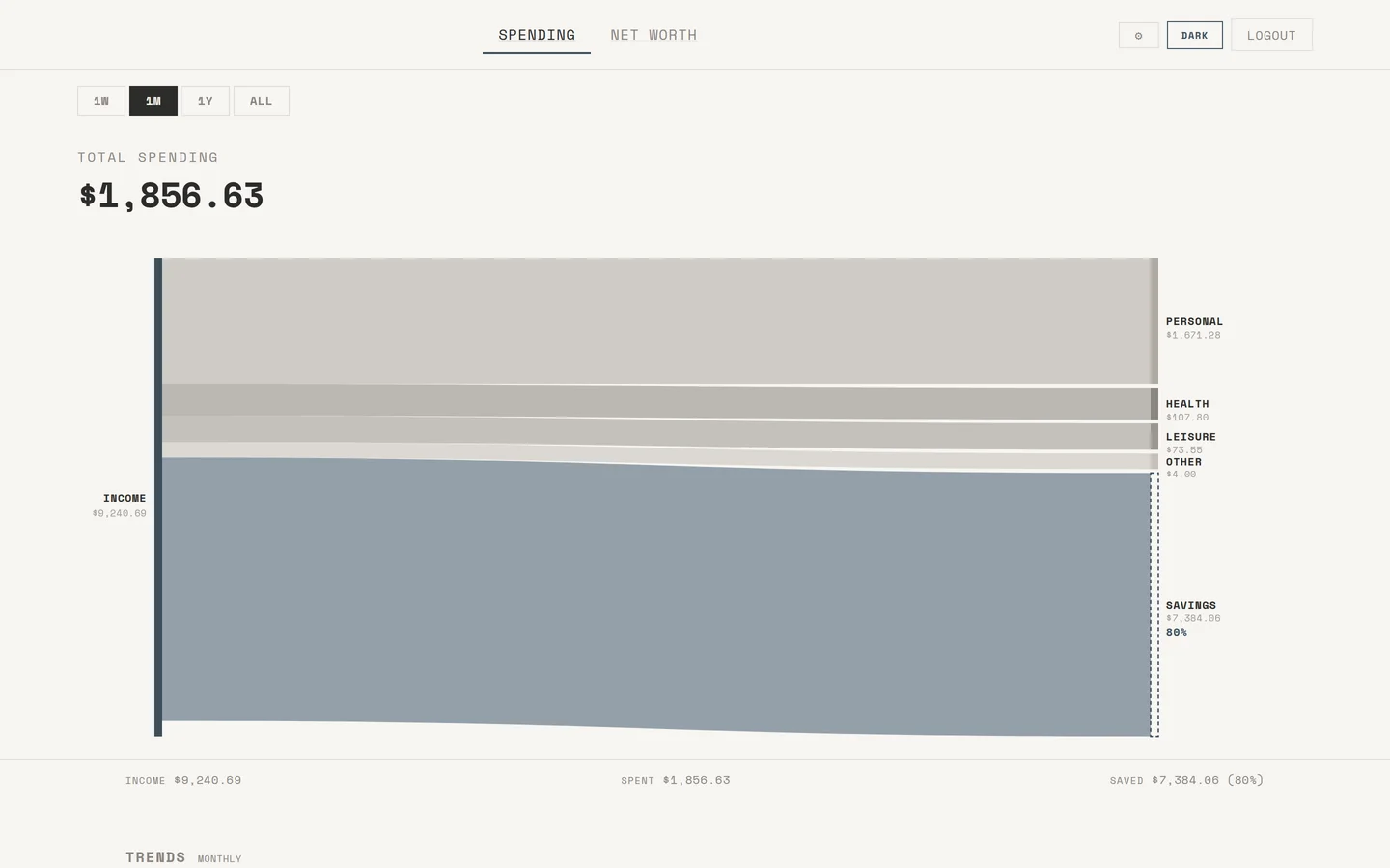
I wanted to actually see where my money goes, so I built this. It pulls every transaction from my Up Bank account, categorises them, and renders the whole picture through custom D3 charts.
Go backend, PostgreSQL, vanilla JS frontend. Sankey flow chart for spending by category with month-on-month trend deltas, a streamgraph for net worth over time where you can click into individual bands, savings goals with progress bars, and a savings rate sparkline in the KPI strip. Categorisation uses pattern matching first, then an LLM for anything ambiguous — a Claude agent runs at 3am on a Mac Mini to classify stragglers automatically.
730+ tests across 14 packages. 3,800+ transactions categorised across 3 years of real spending data. Not a side project I abandoned — I use it every day.