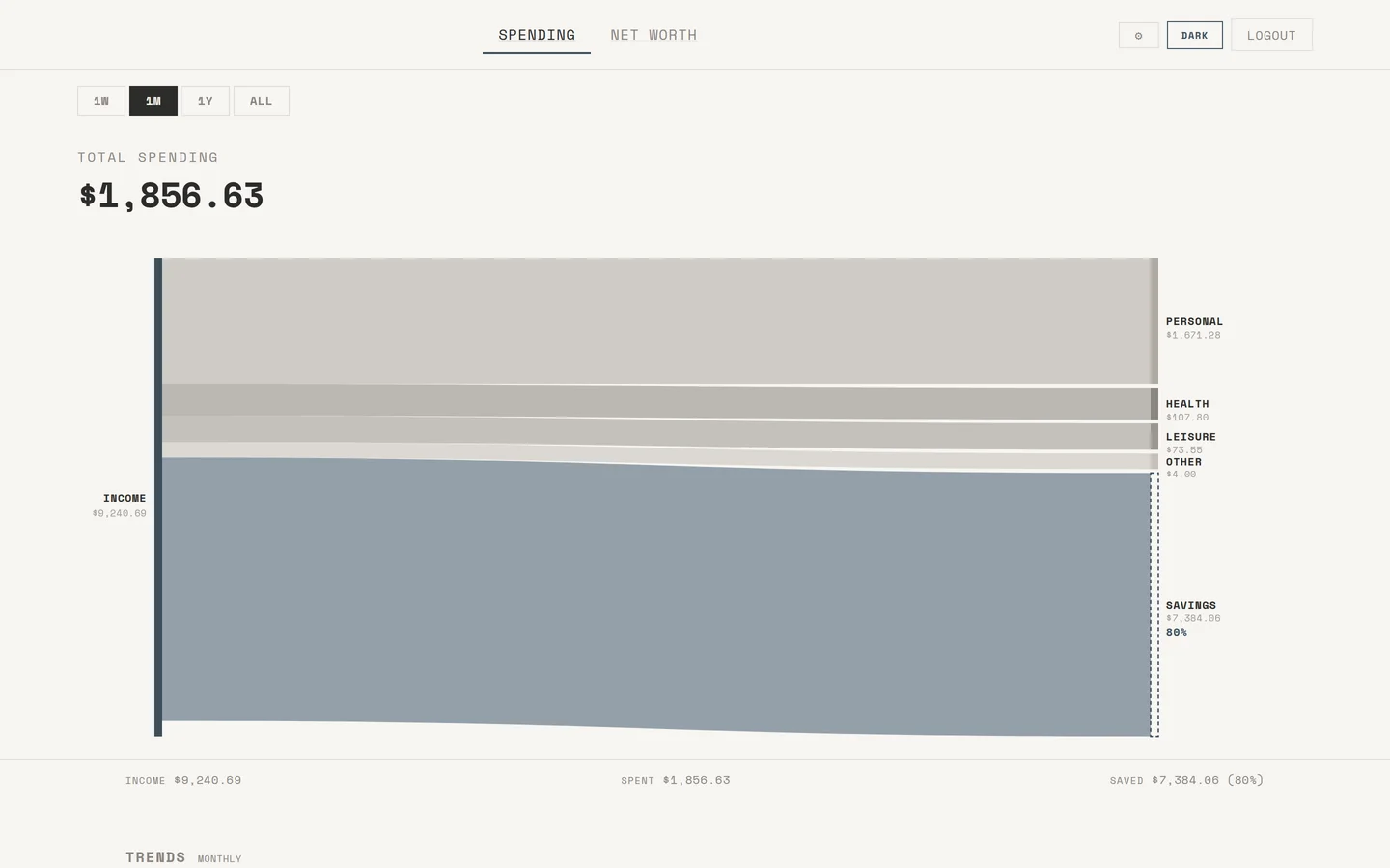
I wanted to actually see where my money goes, so I built this. It pulls every transaction from my Up Bank account, categorises them, and renders the whole picture through custom D3 charts.
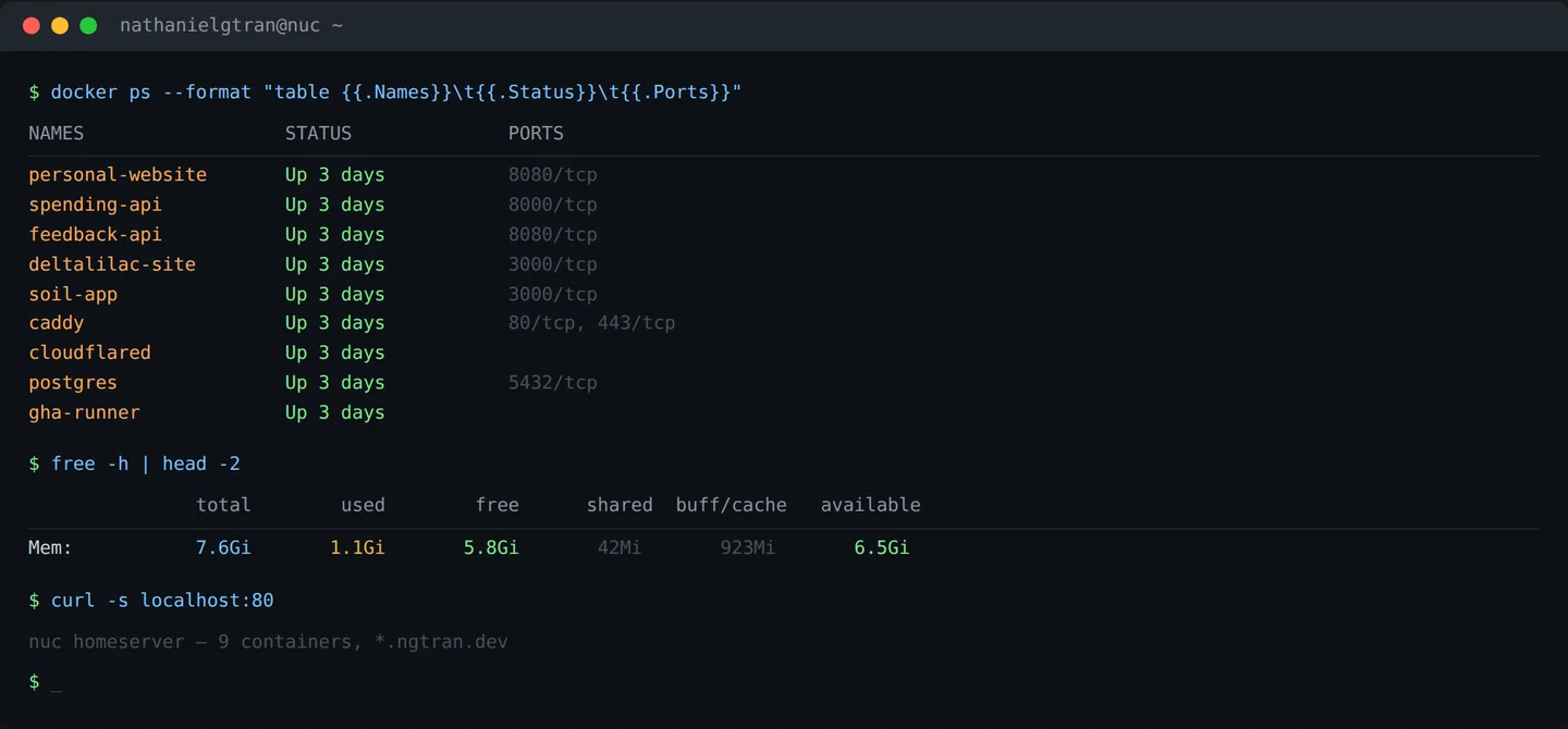
Go backend, PostgreSQL, vanilla JS frontend. There's a Sankey flow chart that shows spending by category, a streamgraph for net worth over time where you can click into individual bands, and a review queue for pending transactions. The categorisation uses pattern matching and an LLM for receipt extraction. Both were overkill. I'd do it again.
3,800+ transactions categorised across 3 years of real spending data. Not a side project I abandoned — I use it every day.